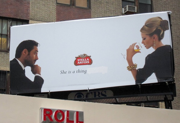
Somehow, I missed this Billboard Liberation Front improvement project that took place in New York City on September 30th. Fortunately though, BLF founder and BB pal Jack Napier updated me as to the various BLF efforts currently underway, including a planned documentary film directed by Olivier 'Dust & Illusions' Bonin! As all of the BLF's projects, this one at the corner of 38th Street and 8th Avenue is an instant classic. The BLF dramatically enhanced the Stella Artois messaging simply by removing the words 'of beauty.' From the BLF:
We at the BLF have been assisting fatigued advertising copywriters to strengthen their corporate messages for over thirty years. Advertising is the language of our Culture, as BLF CEO Jack Napier noted almost as many years ago. And the primary use of language is to to communicate ideas. The most efficient and direct communication of an idea comes through the most elegant use of the least amount of words to communicate that idea. It’s quite clear from the image in this Stella Artois billboard ad what the message IS. The BLF merely wishes to assist this campaign by paring down the words in order to match that message most perfectly.
'Stella Artois, A Thing of Beauty' (Thanks, Jack Napier!)
See Also:
Billboard Liberation Front and Wachovia Bank
Billboard Liberation Front vs. ATT + NSA
Billboard Liberation Front vs. McDonald's
Billboard Liberation Front: video of last night's hit
Billboard Liberation Front hits a Chevron ad in SF
BBtv - Google's 'Great Firewall of China': Fun with the Billboard Liberation Front and monochrom